fight scene test from Scott Davies on Vimeo.
Thursday, 28 February 2013
fight animation test,
well hello my trusty followers, as a treat for you i have put together a short test of my fight scene that will take place in my animation. the red figure is the villain, the green is the hero. just so you can identify as theyres no recognizable detail to them at the mo
Wednesday, 27 February 2013
life drawig 27/02/13 garth olwg
Thursday, 21 February 2013
end of first year glammies sting
this was done for a sting at the end of the first year in uni, i didnt upload it before because i thought it could have been better but looking at it now i love it, it was a collaberative effort with me and 4 others. it was based around the olympics and 2012 as a year and the avengers came out that year
minor project
im posting this up now because im disapointed in the lack of animation on my blog about my animations, i dont post to much of my stuff because im quite embarresed by it and its not up to the standards the course expects. this piece was for a project where we had to design and animate a character to a piece of dialoque. it started of good but then due to an error in filming and trying to redeem it by chopping it up in premier it went downhill fast. but here ya go better later than never
Wednesday, 20 February 2013
life drawing at garth olwg 20/02/13
Monday, 18 February 2013
aliens colonial-marine personal comic strip
after playing aliens colonial marines i remembers that aliens is my favorite movie of all time. i felt inspired to draw a comic sequence of my own story . i believe the story is to hectic for a one page spread but it was a learning curve for me and it helped me push my artistic ability further. i believe my art drives the story on this strip
the strip was drawn using a blue prisma color pencil on Starthmore Bristol 300 series. then inked using pentel pocket brush pens and Sakura pigma fineliners 0.2mm thicknessSunday, 17 February 2013
settings for my fight
these are the backgrounds ill be using for my animation originaly i wanted them to be digital but i felt that the water colour look would give it that cowboy western feel and would add an unnatural grain that i couldnt achieve digitally. i hope you enjoy these and i hope they turn out as imagines in the animation.
 |
| establishing shot to show where the animation is set |
 |
| exterior shot of the saloon where the bad cowboy gets kicked outside |
 |
| this is where the good cowboy will kick the bad cowboy |
 |
| this is where the good cowboy will have his drinking session interupted |
 |
| the good cowboy will sprint towards the gun here |
 |
| this is were our charactes dive for the gun/cover |
 |
| this will be a quick panick pan where the hero quickly looks for a weapon and uses the rock |
Tuesday, 5 February 2013
pre production for final major project.
 |
| styles |
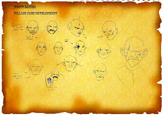
or my final major project animation i will be working with a character interaction that features two cowboys fighting. i have tried to create as much of this world as possible
 |
| setting |
 |
| research cowboys |
 |
| research weapons |
 |
| villain face development |
 |
| hero face development |
 |
| characters side by side |
 |
| hero turnaround |
 |
| villain turnaround |
 |
| hero/villain construction |
 |
| facial expresions hero/villain |
 |
| villain poses |
 |
| more poses |
 |
| further fight poses |
 |
| thumbnail 1 |
 |
| thumbnail storyboard 2 |
 |
| thumbnail storyboard 3 |
 |
| thumbnail storyboard 4 |
 |
| thumbnail storyboards 5 |
 |
| thumbnail storyboard 6 |
 |
| weapons drawings |
 |
| background sketch |
 |
| background photoshopped |
 |
| size comparrison |
Subscribe to:
Posts (Atom)
About Me

- Scott Davies
- hi, my name is scott davies. I am studying animation at glamorgan. i will be posting work from my time at uni such as animation projects. and life/location drawing i do in my spare time world what i do


